Video Commerce appearance: kits and style
Where in the dashboard: Video Commerce › Aparência
The Estilo (Style) area of Video Commerce › Aparência changes the look of every showcase and of the player at once. Start from a ready-made kit, then adjust the colors and shapes you want.
Choose a kit
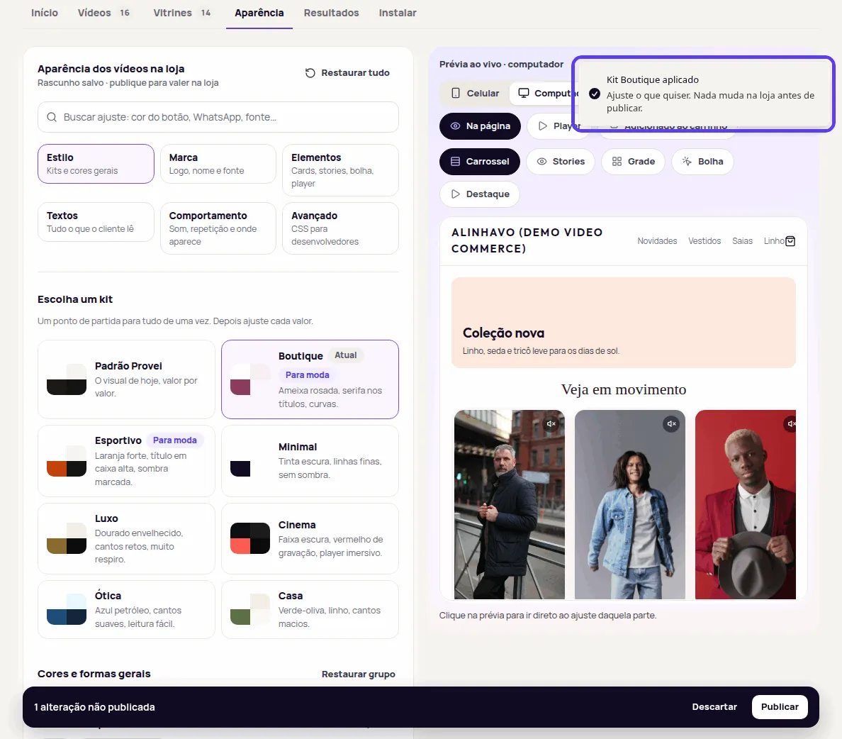
Section titled “Choose a kit”A kit is a starting point for everything at once: colors, corners, shadows, sizes and the look of each element.
| Kit | What it looks like |
|---|---|
| Padrão Provei (Provei default) | Today’s look, value by value. |
| Minimal | Dark ink, thin lines, no shadow. |
| Boutique | Rosy plum, serif headings, curves. |
| Esportivo (Sporty) | Strong orange, all-caps heading, marked shadow. |
| Luxo (Luxury) | Aged gold, square corners, lots of space. |
| Ótica (Eyewear) | Petrol blue, soft corners, easy reading. |
| Casa (Home) | Olive green, linen, soft corners. |
| Cinema | Dark band, recording red, immersive player. |
The order of the kits depends on your store’s segment, and two of them carry the segment tag, such as Para moda (For fashion), Para óticas (For eyewear) or Para casa (For home). The kit in use shows Atual (Current). A kit tagged 1 ressalva (1 caveat) has a color with low contrast: you can still use it.
-
In Aparência › Estilo, under Escolha um kit (Choose a kit), click the kit.
-
If you already changed something, the dashboard asks Aplicar o kit …? (Apply the … kit?) and warns: “Textos, logo e CSS ficam como estão.” (Texts, logo and CSS stay as they are.) Click Aplicar kit (Apply kit).
-
The Kit … aplicado (… kit applied) notice confirms: “Ajuste o que quiser. Nada muda na loja antes de publicar.” (Adjust anything you like. Nothing changes in your store before you publish.) Check the preview.
-
Adjust what you want under Cores e formas gerais (General colors and shapes) and click Publicar (Publish) when you’re ready.
General colors and shapes
Section titled “General colors and shapes”Below the kits, Cores e formas gerais applies to every showcase and the player, unless a showcase changes it for itself. See Per-showcase settings.
| Setting | What it changes |
|---|---|
| Cor de destaque (Accent color) | The play button, the stories ring, the buy button and the focus outline. |
| Cor do texto (Text color) | The showcase text. Da loja (From the store) uses your page’s text color. |
| Fundo da vitrine (Showcase background) | Transparente (Transparent) lets your page background show through. |
| Cor das superfícies (Surface color) | The card of the Highlight format. |
| Cantos (Corners) | Redondos (Round), Suaves (Soft) or Retos (Square). |
| Sombra (Shadow) | Sem sombra (None), Sutil (Subtle), Clássica (Classic), Suave (Soft) or Elevada (Lifted). |
| Tamanho dos vídeos (Video size) | Pequeno (Small), Médio (Medium) or Grande (Large), on computers. |
| Tamanho no celular (Size on phones) | Igual (Same) as on computers, or Pequeno (Small), Médio (Medium) or Grande (Large). |
Mais opções (More options) holds the text on the accent, secondary text, the background while a video loads, border color and width, and shadow colors. Para desenvolvedores (For developers) holds the focus outline, which shows when a customer navigates with the keyboard.
To change a color, choose Escolher cor (Pick color) and use the color square or type the code, such as #8c3b5e. In fields with Automático (Automatic), Provei picks a readable color from the accent color or the player theme.
Elements in detail
Section titled “Elements in detail”To go beyond the general colors, open Elementos (Elements). Each tab holds the settings of one part:
- Cards: Formato dos cards (Card shape) in carousel and grid (Retângulo (Rectangle), Quadrado (Square), Círculo (Circle), Flor (Flower), Coração (Heart) or Selo (Badge); apart from the rectangle, videos show in a square crop), Posição da fileira no computador and no celular (Row position on computers and on phones: Esquerda (Left), Centro (Center) or Direita (Right), when the videos don’t fill the whole width), play icon, heading alignment, size, case and weight, the space between videos and above and below the showcase.
- Stories: the ring (Cor de destaque, Uma cor (One color) or Degradê (Gradient)), the ring color and the text below.
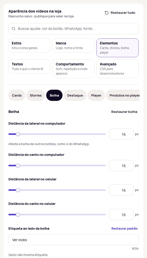
- Bolha (Bubble): Formato da bolha (Bubble shape: Círculo (Circle), Arredondado (Rounded), Quadrado (Square), Flor (Flower), Coração (Heart) or Selo (Badge)), distance from the side and from the corner, on computer and on phone, the label and the Estilo da etiqueta (Label style: Etiqueta (Tag), Curva (Curved), where the text follows the bubble’s lower edge, or Sem etiqueta (No label)), the ring and the colors of the button that minimizes the bubble.
- Destaque (Highlight): card text color and the corners of the Assistir (Watch) button.
- Player: Estilo do player (Player style), Ajuste do vídeo (Video fit), player theme (Escuro (Dark), Claro (Light) or Cor da marca (Brand color)), the player accent, window corners and how much to dim the page behind.
- Produtos no player (Products in the player): the product card, the variant choice and the style, color and corners of the buy button.
In Player:
- Estilo do player (Player style): Imersivo (Immersive), the default, makes the video full screen on phones, with the products over it. Vitrine (Showcase) shows the video on top and the product list below. On computers both look the same.
- Ajuste do vídeo (Video fit): Automático (Automatic) fills the screen when the video has nearly the same shape and, if not, shows the whole video over the blurred image. Preencher a tela (Fill the screen) may crop the edges. Mostrar o vídeo inteiro (Show the whole video) never crops.
Both can also change for one showcase only, in the editor’s Estilo (Style) section. See Per-showcase settings.
To see the player with your settings, choose Player in the Prévia ao vivo (Live preview). On a phone, the preview shows the player the way customers see it: the video, the controls, the products and the “Tecnologia por Provei.AI” badge.
Move the bubble away from the WhatsApp button
Section titled “Move the bubble away from the WhatsApp button”If the bubble covers the WhatsApp button or another button in the page corner, open Elementos › Bolha and raise Distância da lateral (Distance from the side) or Distância do canto (Distance from the corner). There is one pair for computer and one for phone. Search “whatsapp” in the settings search to get there directly.
Contrast warnings
Section titled “Contrast warnings”When a color is hard to read on its background, the field shows the contrast and the recommended minimum, for example: “Contraste 1,21:1 com cor das superfícies. O mínimo para texto é 4,50:1. Você pode publicar assim.” (Contrast 1.21:1 with the surface color. The minimum for text is 4.50:1. You can publish as is.) The top of Estilo also says how many colors have low contrast.
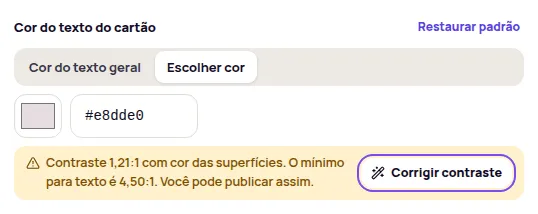
The warning never blocks anything. Click Corrigir contraste (Fix contrast) to switch to the readable color closest to yours, or keep your color and publish.
Frequently asked questions
Does applying a kit delete my logo or my texts?
No. The kit changes colors, corners, shadows and the look of the elements. Texts, logo and CSS stay as they are.
Does the low-contrast warning stop me from publishing?
No. The warning only advises. You can publish as is, or click Corrigir contraste (Fix contrast) to use the readable color closest to the one you picked.