Video Commerce appearance: advanced CSS
Where in the dashboard: Video Commerce › Aparência
The Avançado (Advanced) area of Video Commerce › Aparência is for whoever looks after the store’s code. It has two CSS fields that apply to every showcase, one for the showcases and the bubble and one for the player. The CSS only reaches the public parts listed on this page and is checked before it is saved.
Before writing CSS, check whether the setting already exists in the dashboard: most color, corner, size and text changes are in Estilo, Elementos and Textos, with a preview.
Where each CSS applies
Section titled “Where each CSS applies”| Field | Where it is | Where it applies |
|---|---|---|
| CSS do tema (Theme CSS) | Aparência › Avançado | Every showcase and the bubble. |
| CSS do player (Player CSS) | Aparência › Avançado | The player only. |
| CSS personalizado (Custom CSS) | Showcase editor, in Avançado (para desenvolvedores) | That showcase only. |
Each field takes up to 10,000 characters. Adding up the theme, the player and every showcase, the limit is 30,000 characters.
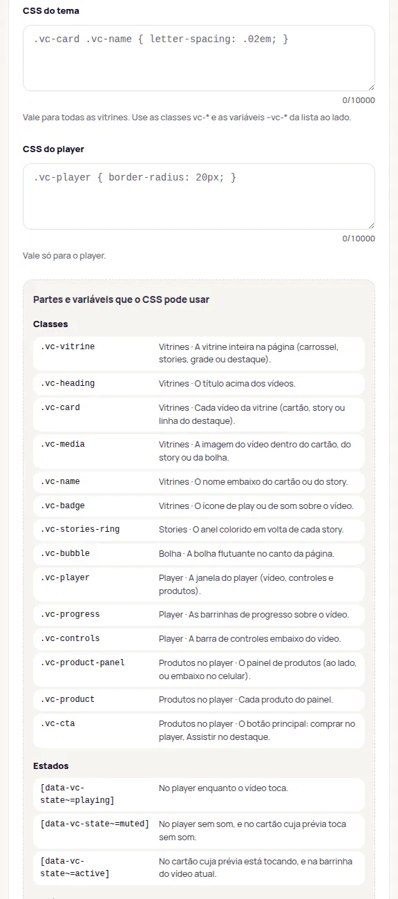
Public classes
Section titled “Public classes”The CSS can only use these classes. They are stable: new classes may arrive, but these don’t change name.
| Class | Part |
|---|---|
.vc-vitrine |
The whole showcase on the page (carousel, stories, grid or highlight). |
.vc-heading |
The title above the videos. |
.vc-card |
Each video in the showcase (card, story or highlight row). |
.vc-media |
The video image inside the card, the story or the bubble. |
.vc-name |
The name under the card or the story. |
.vc-badge |
The play or sound icon over the video. |
.vc-stories-ring |
The colored ring around each story. |
.vc-bubble |
The floating bubble in the page corner. |
.vc-player |
The player window (video, controls and products). |
.vc-progress |
The progress segments over the video. |
.vc-controls |
The control bar under the video. |
.vc-product-panel |
The product panel (alongside, or below on phones). |
.vc-product |
Each product in the panel. |
.vc-cta |
The main button: buy in the player, Assistir (Watch) on the highlight. |
.vc-bubble-label |
The bubble’s label: below it, or the curved text along its lower edge. |
.vc-bubble-tab |
The tab the bubble turns into when the customer minimizes it. A tap on it brings the bubble back. |
.vc-cta-link |
A video’s Botão com link (Button with link), shown instead of the products (also has .vc-cta). |
.vc-whatsapp |
The WhatsApp question: the button, the question field and the send link. |
.vc-price |
The store’s price in the player. |
.vc-price-list |
The struck De (From) price. |
.vc-price-now |
The current price: Por (Now) or A partir de (Starting at). |
.vc-price-discount |
The discount, such as “25% OFF”, in the player and on the shoppable card. |
.vc-installments |
The interest-free installments line. |
.vc-buy-together |
Compre junto (Buy together) in the player. |
.vc-buy-together-item |
Each Compre junto product, with its checkbox. |
.vc-buy-together-cta |
The Compre junto button (also has .vc-cta). |
.vc-shop-card |
The whole shoppable card (also has .vc-card). |
.vc-card-controls |
The round buttons at the top of the shoppable card. |
.vc-card-toggle |
The shoppable card’s button to pause and play its preview. |
.vc-card-sound |
The shoppable card’s sound button, which opens the player with sound. |
.vc-strip |
The product strip at the bottom of the shoppable card. |
.vc-strip-thumb |
The product photo in the strip. |
.vc-strip-name |
The product name in the strip. |
.vc-strip-price |
The price line in the strip. |
.vc-strip-add |
The strip’s bag. |
.vc-strip-link |
The strip’s Ver produto (See product) link, when it can’t add from there. |
.vc-product-strip |
In the immersive player, the product strip over the video. |
.vc-product-sheet |
In the immersive player, the panel that opens from the strip to choose a size and add. |
.vc-overlay-controls |
In the immersive player, the controls over the video. |
States
Section titled “States”The data-vc-state attribute says what state a part is in. A part can have more than one state at a time, such as a player playing without sound, so use ~=:
| Selector | When it applies |
|---|---|
[data-vc-state~=playing] |
On the player while the video plays. |
[data-vc-state~=muted] |
On the player without sound, and on a card whose preview plays muted. |
[data-vc-state~=active] |
On the card whose preview is playing, and on the segment of the current video. |
Two more attributes help with styling:
[data-vc-sale]is on the shoppable card’s strip and on the player’s product when the price is on sale, for example[data-vc-sale] .vc-price-now.[data-vc-layout=imersivo]and[data-vc-layout=vitrine]tell which Estilo do player (Player style) is in use on phones.
Variables
Section titled “Variables”Each dashboard setting also has a --vc-* CSS variable, such as --vc-accent for the Cor de destaque (Accent color). The full list is in Avançado, under Partes e variáveis que o CSS pode usar (Parts and variables the CSS can use), and in each group’s Para desenvolvedores (For developers), under Variáveis CSS deste grupo (CSS variables of this group). Use the variables in the CSS do tema.
Examples
Section titled “Examples”Space out the letters of the name under each video, in the CSS do tema:
.vc-card .vc-name { letter-spacing: .02em;}Round the player window more and highlight the buy button, in the CSS do player:
.vc-player {  border-radius: 20px;}
.vc-player .vc-cta:hover {  filter: brightness(1.1);}
Hide the sound icon on cards that play muted, in the CSS do tema:
.vc-card[data-vc-state~=muted] .vc-badge { opacity: 0;}What the dashboard checks
Section titled “What the dashboard checks”On save, the dashboard checks the CSS. If something doesn’t pass, the field shows why and the draft keeps the last valid CSS. The rules:
- Selectors: only the
vc-*classes above,data-vc-*attributes,:scope(the showcase root) and common pseudo-classes, such as:hover,:focus-visible,:first-child,:nth-child(),::beforeand::after. Tag, id and other class selectors are left out. - At-rules: only
@mediaand@supports. No@import,@font-faceor@keyframes. - No outside content: no
url()or other functions that load images. - Stay inside the showcase:
positionandz-indexaccept limited values (the field tells you why when it rejects one); no viewport units, such asvwandvh. - No tricks: no nested rules and no
\escapes.
This way, the CSS only changes the look of the showcases and the player.
To place a showcase with a page selector, see Advanced (for developers).
Frequently asked questions
Do I need CSS to change colors, corners or the font?
No. Colors, corners, shadows, fonts, texts and the look of each element are in the other Aparência areas. Use CSS only for what the dashboard doesn't cover.
Can I use the internal classes I see in the browser inspector?
No. The CSS only reaches the public vc-* classes and the data-vc-* attributes. Other classes can change at any time, and the dashboard refuses CSS that uses them.